When it comes to design, I’m not one for keeping with the same old thing. I love trying new ways to do things, including card making. I really enjoy hearing or seeing the comments about it after someone opens up a box or a oddly shaped card. One year, for a bridal shower I was co-hosting – I made little rolled up scroll invitations and sent them out in little boxes with meringues for a princess theme. People love getting something unexpected! (Especially in the mail – I think.)
While working in an advertising and design department, someone once said there was nothing truly new in design. What they meant was that we get inspired by other designs and everything around us. I find that especially true when making printable pieces.
So, I thought it would be fun to share some of the invitations I made in my b.b. (before blogging) days to give some inspiration to think out of the box with your own cards or invitation. These are just a few examples from the last few years I hosted an annual Ladies or Mother’s day Brunch.
I really like the concept of this design because it feels so unexpected. You pull out the “flowers” and there is the invitation information!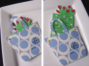 This next one is similar in that you have to pull out the card to get to the information. I used flowers again – being the occasion was Mothers’ day. I printed on one side of the cardstock, folded it over and cut around the smaller flower. I used grommets on top and bottom to keep it from unfolding and used the different colors in the center of the flowers, without going through both sides. Then I tucked the information card inside. Fun!
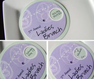
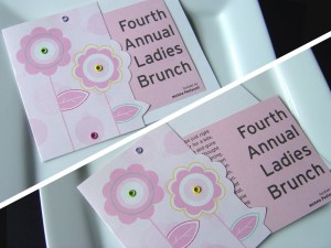 By now you can see I like using grommets. 🙂 This was my second favorite invitation of the 6 years I sent out brunch invitations. It spun and the text was kept simple. I used a circle cutter for these and once I got in a rhythm it went fairly quickly.
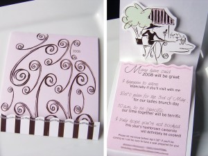
 And now my all time favorite, I love the inside design. “French cafe/bistro” – Ahhh Just saying it makes me want to grab an espresso and relax. This was a fun pop up card I created. Took some manipulating but I finally got it to work (though it was hard taking the photo.) It folded down into the striped “pocket” and I added some glitter glue to the edge. When the card opened the bistro scene popped up and the inside card was a bit raised. The wavy edges were cut with craft scissors.
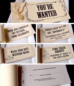
 This next image is of an invitation I made for a second reception for my husband’s brother and his wife. They had an out-of-town wedding and we threw them a party for local friends. My brother-in-law was a horse trainer at the time so the western theme seemed fitting. What a fun party that was for me to style! Hay bales, cowboy hats, red checkered tablecloths, bandanna wrapped utensils and cowboy boot vases. You’ll notice more grommets in this invitation, tying the whole thing together, this one is more like a booklet with the postcard rsvp at the end.
 I hope you’ve enjoyed my stroll down inspiration lane. Do you ever look back at some of the things you’ve done and say “I did that? Cool!” Well, anyway. Maybe I’ll share some more bb stuff with you now and then, ‘kay?
Thanks for visiting! Ya’ll come back now, ya hear!
p.s. we’re up to 84 fans – getting close to the first giveaway drawing! (see here for more details)


Seriously creative! I love being exposed to new ideas.
Thank you!
Love them all. I seriously love the purse with flowers. You are so creative!! Thanks for sharing.