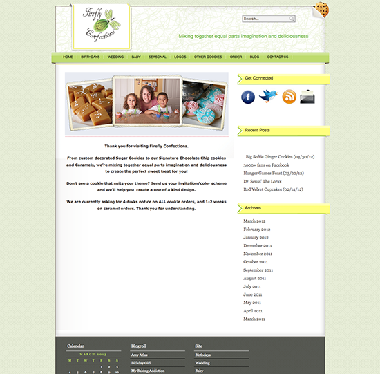
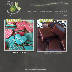
When Sandy of Firefly Confections first contacted me about a new design for her website I was pretty excited. I’ve heard so many yummy things about Sandy’s caramels and her cookies are so cute and she is JUST as sweet! She sent over some ideas, indulged me in filling out my questionnaire and showed me an ad that had been designed for her so off I went. The chalkboard background is quite popular and I absolutely love how this turned out from the rotating home page images to the chalk line borders on her gallery photos. Show Sandy some love – and definitely contact her with your caramels order!
// michele
(website best viewed in any browser other Internet Explorer)
Before:
After:


I love Sandy’s new site!!! Great work Michele!