Over the years I’ve come across many people who aren’t quite sure how to use images/photos or graphics effectively when designing so I thought I’d share a few basic, quick tips!
1) DON’T ENLARGE!
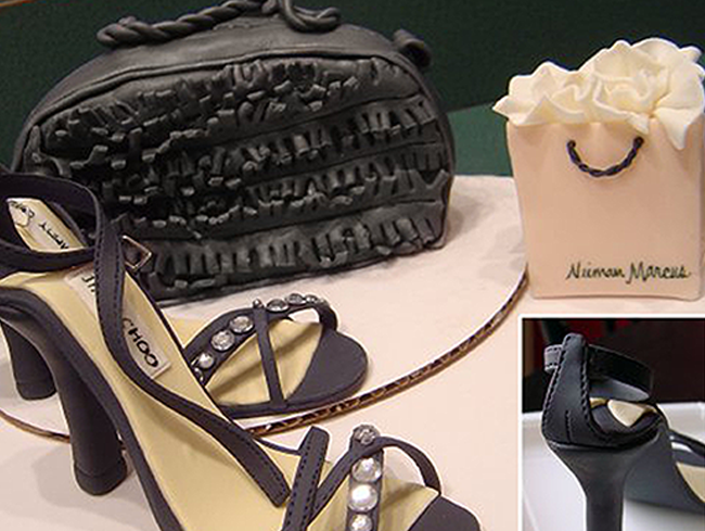
A common mistake. When you enlarge an image the program has to guess where to add those extra pixels in order to fill the larger space. This creates a ‘pixelated’ and blurry photo.
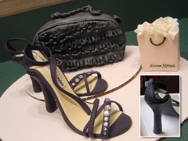
Enlarged image looks grainy around most of the contrasting areas. (see below)
2) RESOLUTION
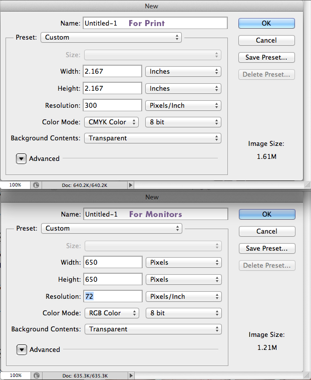
Will your photo be printed? Will the design be for online use alone? These are extremely important questions as resolution is key to a quality photo or design. Typically, an image that is being seen only online, in jpg or png format, need only be 72 dpi (dots per inch). (Monitors use pixels so dpi is also seen as ppi or pixels per inch. These acronyms are often used interchangeably.) In contrast, when you are aiming to print your image/design you will want it to be 300 dpi.
3) COLOR
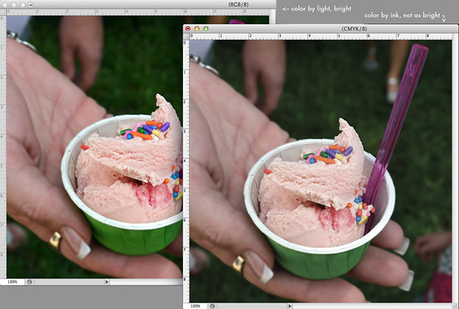
If your image/design will be printed be sure it’s in CMYK color mode. Printers use Cyan, Magenta, Yellow and Black ink, not the monitor’s light based color mode of RGB (Red, Green and Blue.) If the file is set to RGB and it is sent to print, the program has to calculate how to separate RGB and convert to 4 different colors (CMYK) and your design won’t look quite the same. On a side note, home printers are often designed with the ability to convert RGB files to ink colors and tend to do a decent job, but if you’ll be sending your design to a shop they’ll need it to be set to ink colors. Also, photo labs seem to prefer RGB as they’re prepared for files straight from your camera. p.s. Facebook hates CMYK.
Keep these tips in mind and your images will always look as they should!



Great tips!! I can’t tell you how long it took to figure this out (it is embarrassing.) Wish this post had come along before then!