What do an emblem, a symbol and an icon have in common? They’re all words we use to refer to a logo. Truly though, they are not the same or interchangeable. It’s helpful to understand the differences in terminology especially when trying to explain preferences to your design professional.

As you know, the commonly used word for a brand identity is called a “logo”. We lump both a graphic and text based design into that one title and generally speaking that’s quite all right. When we’re trying to refer to parts of the design though, it tends to get confusing, specifically when there is more than one element to the design. There are many names for these little elements – logo, emblem, icon, symbol, logomark, combination mark, etc. and below I’ll briefly share their differences.
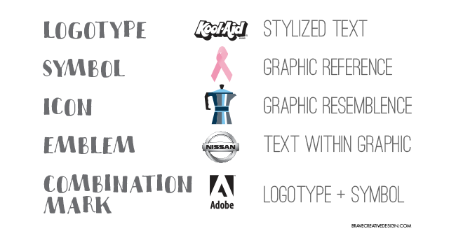
The word “logo” is known to have come from “logotype”, a greek word meaning “word imprint” also known as “wordmark.” This refers to stylized text, and only text, specifically, the name of the business.

Alternately, when just a graphic is used, such as the bitten apple I see on the iMac in front of me, this is called a “symbol.” When a graphic represents something, such as the dove for peace or the plus sign for the Red Cross, it’s referred to as a symbol. The symbol doesn’t look like it’s name, it’s a reference for it. You might also call this art an “icon.” But, different from a representation of an idea, an “icon” resembles an object, such as a house for “home” or a telephone for “contact.”
![]()
How about a couple more. When the text is positioned inside the graphic element, such as Starbucks or Ford, it is called an “emblem.” And when both a logotype and a symbol are used together but not inside the other, it is considered a “combination mark.” Combination marks are probably the most common of “logos.” For instance, when the Nike swoosh is positioned above the logotype “NIKE” it’s really a combination mark. It is widely accepted though, that the combination mark simply be called the “logo” but you can see why it would be helpful to clarify to the shoe designer that the company wants only the “symbol” (swoosh) on the side of the shoe and not the “logo” (both swoosh and text.)

One more… Buttons. This term is commonly used in place of the word icon and they are very similar. A “button”, though, is interactive. It is most often an icon but can also be a symbol or logotype and it must be ‘clickable.’ If you can click it and it leads somewhere, then it’s a button.


Leave a Reply