Well hello again! After last week’s little personal chat I thought I might share about a design I worked on earlier in the year. It’s fun, fanatical and all around fabulous! I had the pleasure of once again working with Sandy (Firefly Confections) on her latest adventure and it’s sorta-kinda up my alley. I’m a big time fan of stories of most any kind, and from all arenas – movies, tv, books, of course… real life. Biographies are some of my favorite kind of stories. Annnd, I guess you could say I’m surrounded by comics since my husband is a comic book/story board artist. (You should totally check out his instagram feed.) So naturally I asked for his insight when tasked with the design of a logo and a blogsite relating to fandom.
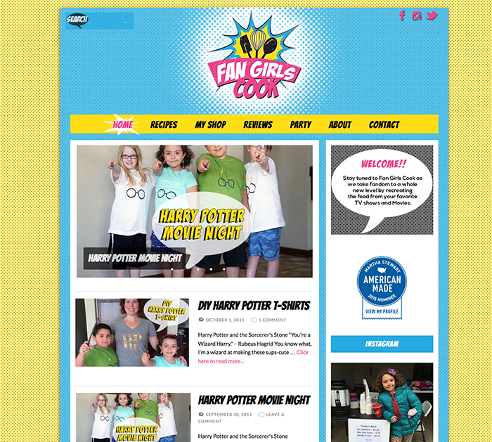
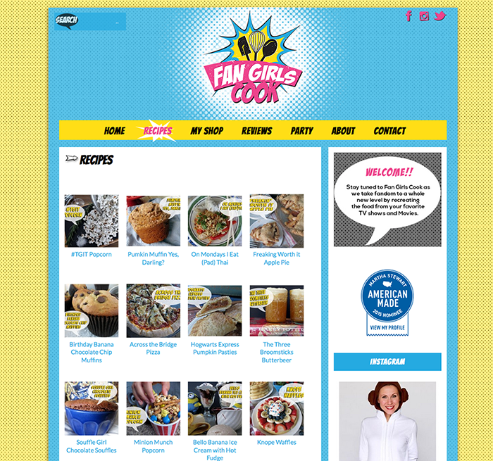
The colors are bold, not fluffy. The logo has the retro look that I consider to be very important for something of this nature. The blog design is a bit reminiscent of the old printed comic books with a lightly distressed feel.

The best part of the blog is it’s content. Sandy has outdone herself sharing recipes that have been a part of our favorite TV shows, books and movies. It’s amazing. She’s also sharing book reviews and even DIYs!
Feel free to hop on over and check out the website, print a few recipes and send Sandy some comment love. I’m sure she’ll find it FAN-tastic!


I could not have asked for a better website design or logo. It was exactly what I pictured in my head. But more importantly I couldn’t ask for a nicer, easier person to work with. You understand my vision and my inability to coexist with technology. I don’t want to make this weird but, I love you.
Aww, thank you!!!
I love the concept and as a long time fan girl myself, I am definitely going to follow and hopefully cook along! 🙂